As a Danish company, creating and designing kitchens for more than 40 years, Danish design is close to our hearts. As we've expanded into more and more countries, we've noticed a need to be able to explain to new audiences what Danish design is and what makes it special. For this, our first podcast series, we've talked to a number of experts on Danish design to try to learn just that.
You've probably seen examples of Danish design and maybe you didn't even know it. One of the most famous examples of Danish design is turning 50 years old this year. Can you guess what it is? It's the Sydney Opera House. This iconic building, despite its location in Australia, was designed by Danish architect Jørn Utzon. And its distinctive design is known around the world.
*Please note that the text on this page is a transcript of the podcast episode.
It's all about the chairs
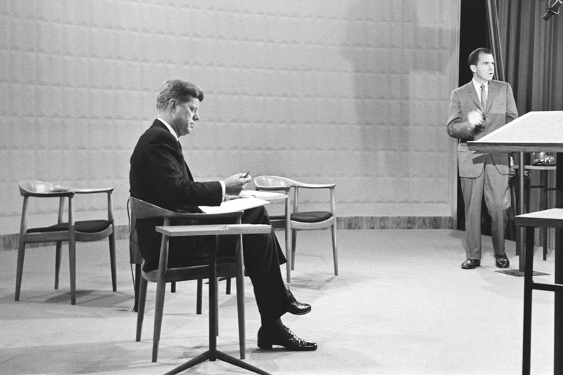
Chances are you've also seen a lot of chairs by Danish designers. Kennedy and Nixon famously sat in the Round Chair by Hans Wegner at the first ever televised presidential debate in 1960. And even if you weren't around then you've seen photos of them in those chairs.
The Trusteeship Council Chamber at the United Nations Headquarters in New York was decorated and furnished by Danish designer Finn Juhl in 1952. It was renovated in 2013 by Danish design duo Kasper Salto and Thomas Sigsgaard, who stayed true to Finn Juhl's original vision with an update for the 21st century. You often see this magnificent room on the news when the UN is in session.
And you no doubt have seen the Egg or Swan chairs that were created by Arne Jacobson for the Royal SAS Hotel in Copenhagen, and which have become Danish design icons. You've seen them in hotel lobbies and airport lounges all over the world.
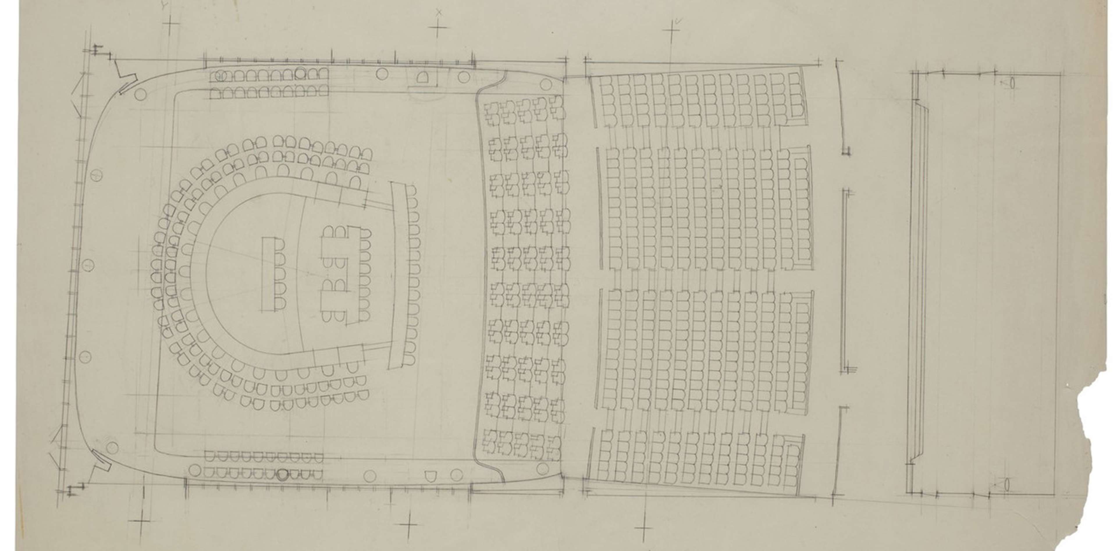
UN Trusteeship Council Chamber
Finn Juhl's original drawing of the chamber. Photo credit: House of Finn Juhl
Read more at House of Finn Juhl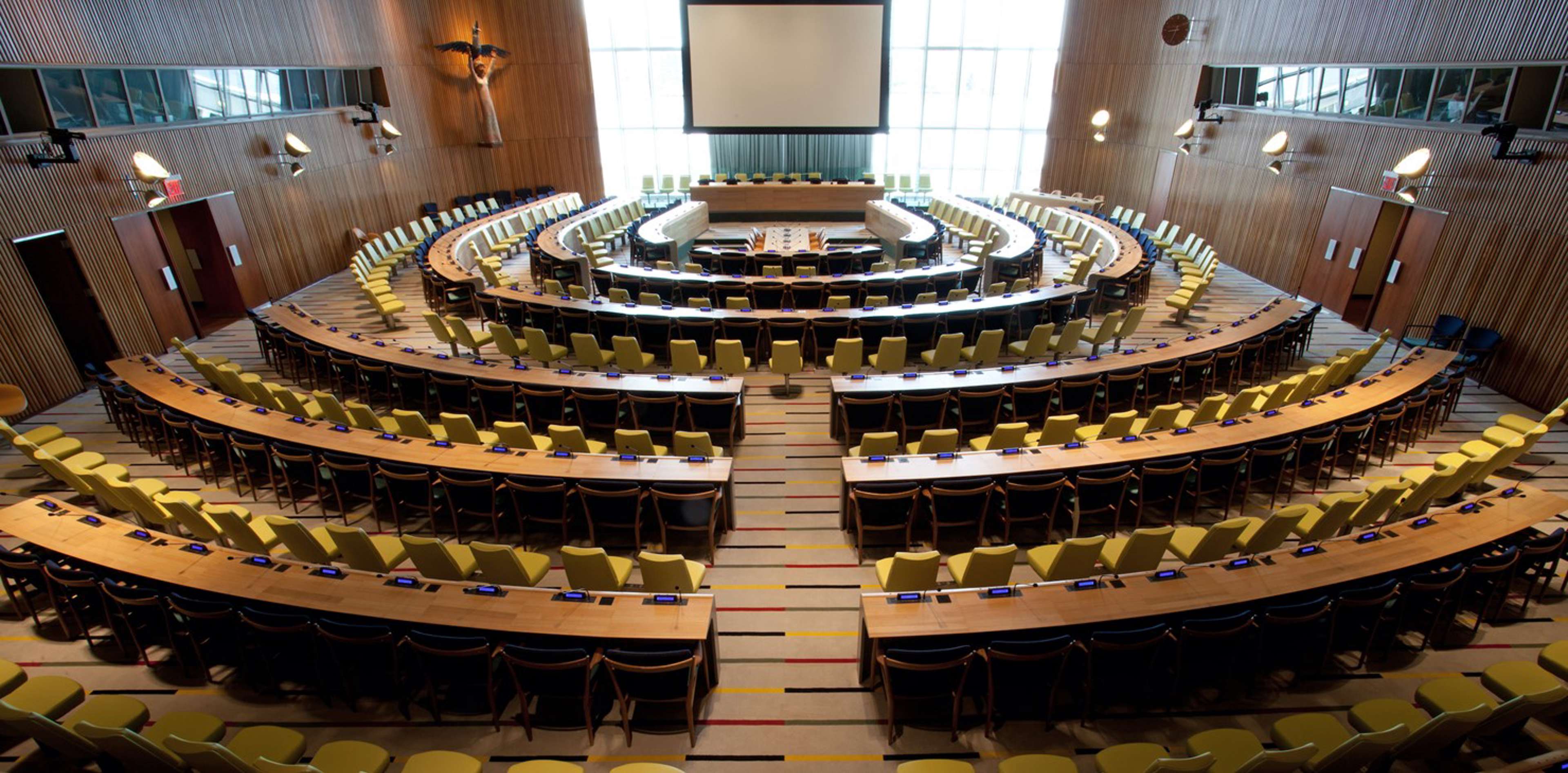
The updated chamber
Danish design duo Salto & Sigsgaard updated the chamber in 2013. Photo credit: House of Finn Juhl
Read more at House of Finn Juhl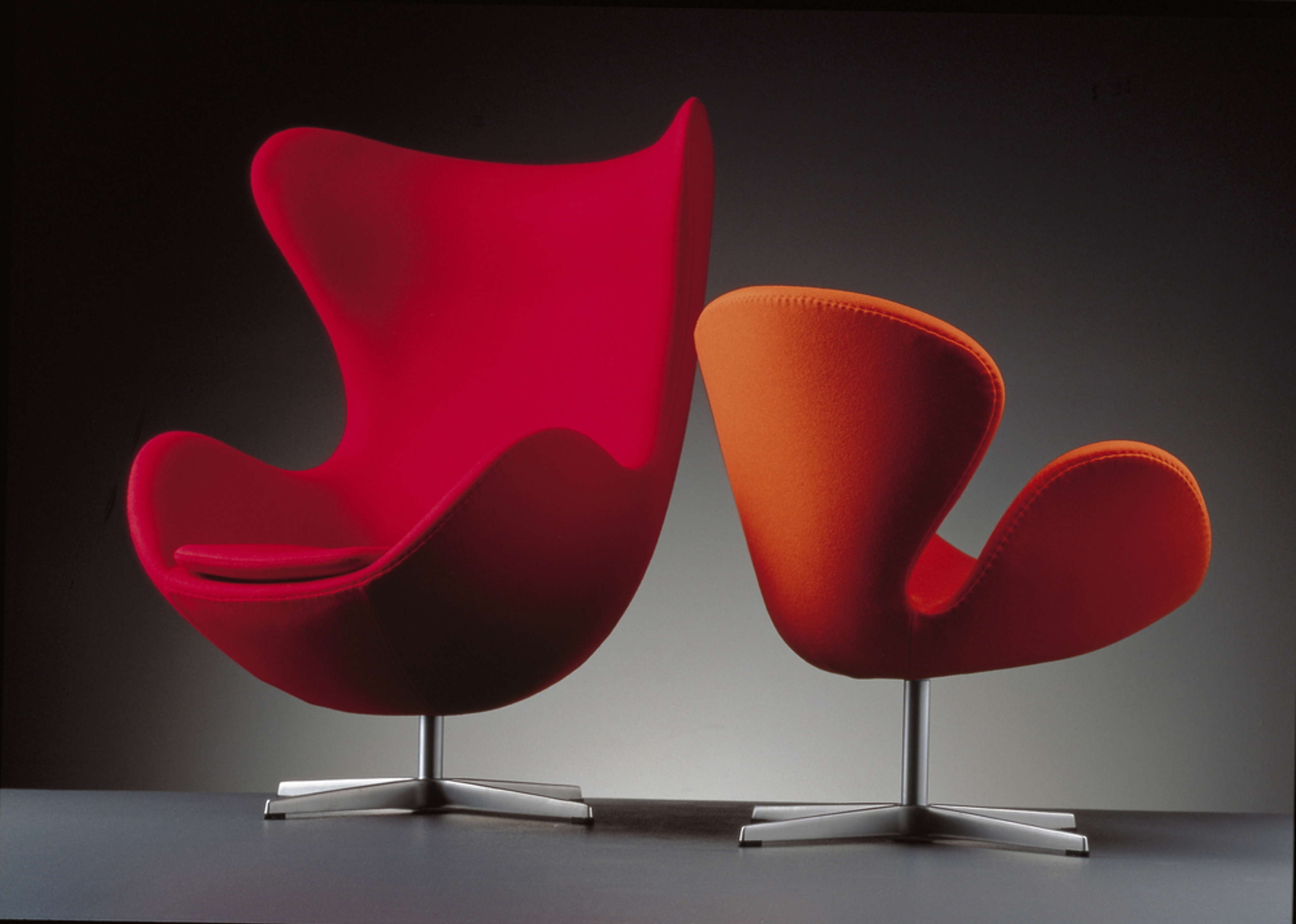
Egg & Swan by Arne Jakobsen
Photo credit: Fritz Hansen
What makes Danish design Danish design?
But let's get into what makes Danish design Danish design.
Like many people these days, we asked ChatGPT, and here's what it came up with.
Danish design refers to a style of functionalistic design and architecture that emerged in the mid 20th century, specifically in Denmark. It's characterised by simplicity, minimalism and functionality. This approach is rooted in the Scandinavian tradition of craftsmanship and a design philosophy that emphasises a product's utility over unnecessary decoration.
And then of course, ChatGPT gave us one of their ubiquitous lists of key features like simplicity, clean lines, functionality, craftsmanship, and natural materials.
In the mid 20th century, a number of Danish designers gained international prominence, and we've already mentioned Arne Jakobsen, Hans Wegner and Jørn Utzon and include Poul Henningsen and Verner Panton. Their chairs, lamps, and other items have become iconic pieces of modern design.
This design ethos has had a lasting impact and continues to influence contemporary design worldwide. Danish design principles can be seen in furniture, lighting, textiles, homewares and architectural projects all over the world.
Honestly, that's not a bad description, ChatGPT.
Photo credit: Design Museum Denmark
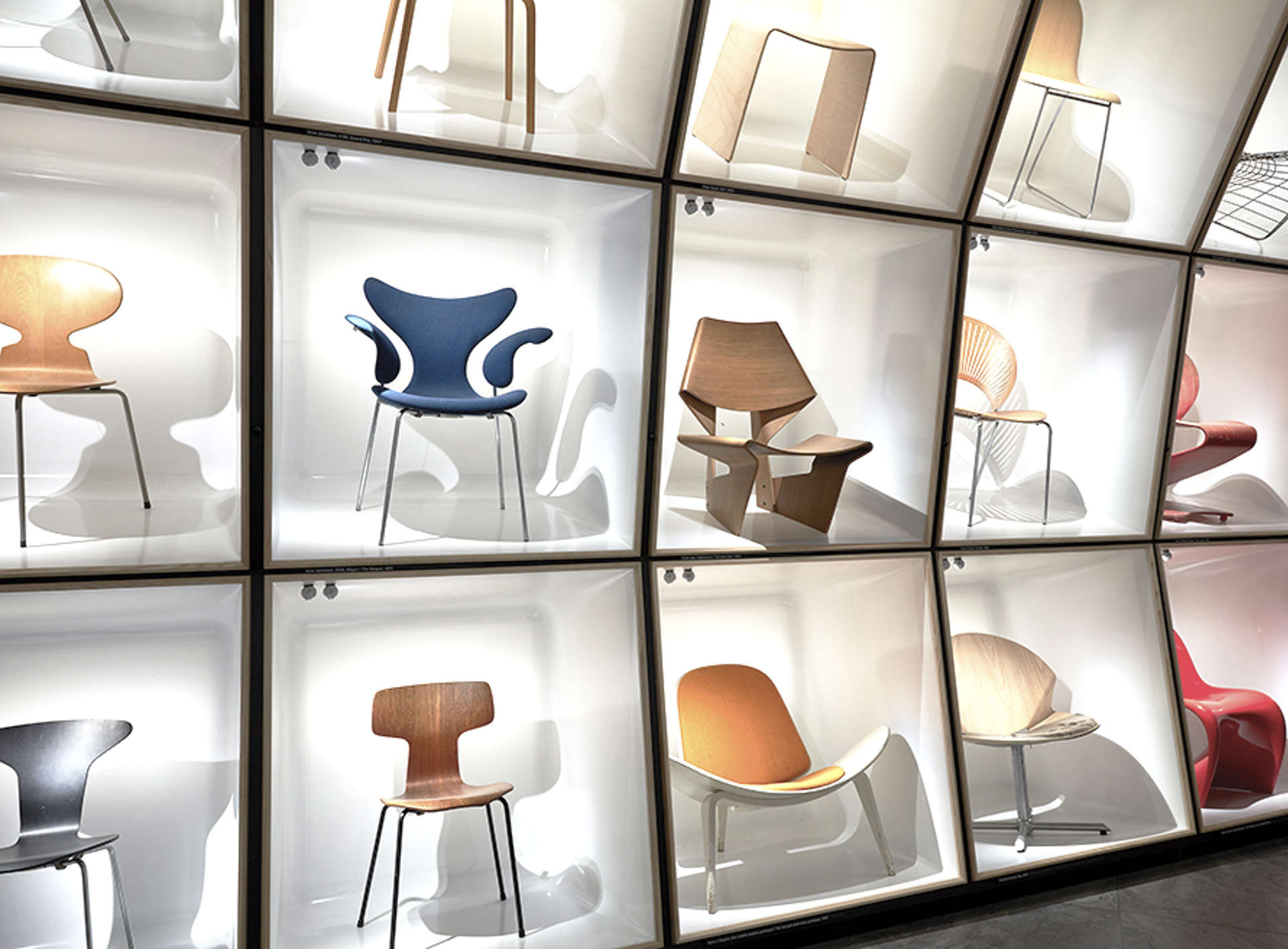
And even ChatGPT mentions the iconic chairs, so it can seem like they're all there is to Danish design. We decided to discuss what makes the chairs so special with former chair (no pun intended) of the Danish Design Council, Lars Thøgersen.
Lars: We are in particular good in areas, as Danish designers, that are close to the body. Are close to the human. So..
Julie: So that's why we have all the chairs.
Lars: That's why we have all the chairs!
Lars: Also, because you could say that a chair, is maybe, at one time, it's very simple. It only has to raise your butt about 40 to 45 centimetres above the ground. It has to give some you some kind of rest and comfort. So there's a lot of easiness to it, and then the other side it's so simple that how can you then cut that down to be essential and still make it, you know, visually and aesthetically pleasing to have around you or or in your sitting room or in the meeting room or whatever it's used.
Photo credit Magnus Olesen chair: AndLight
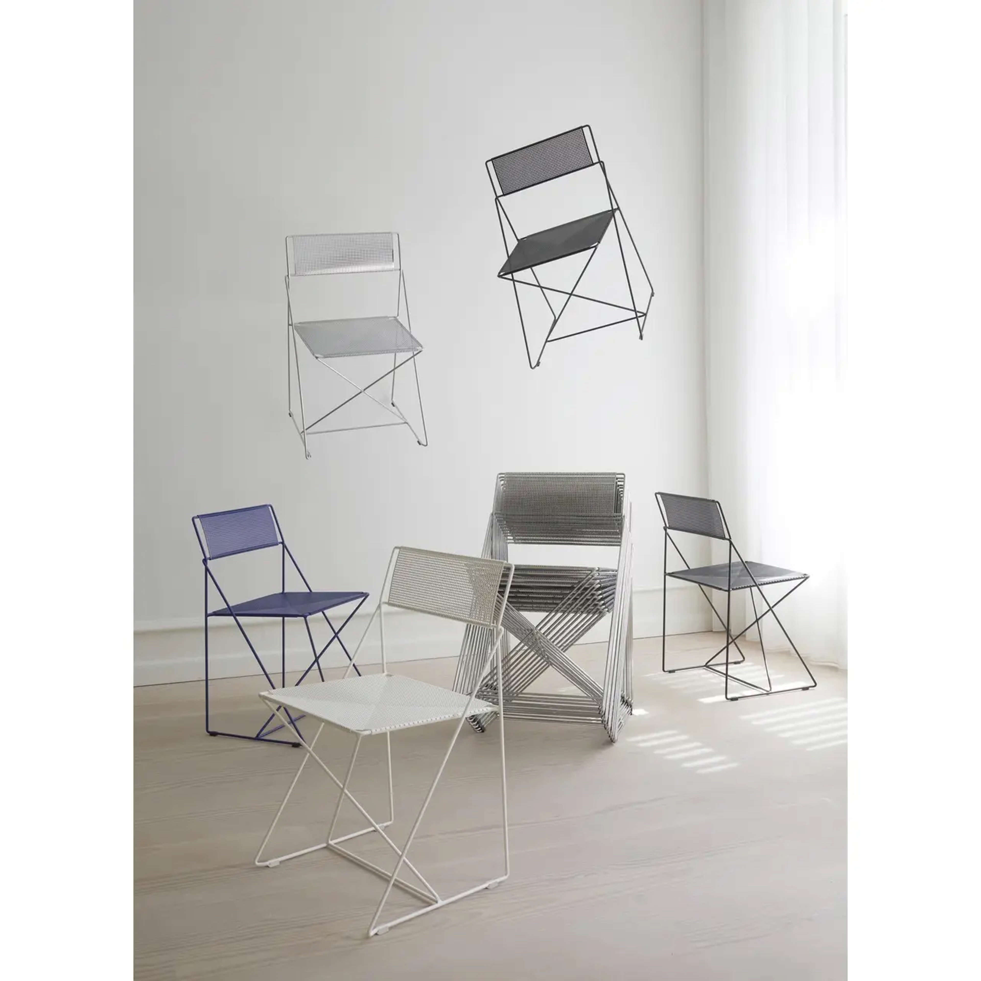
So it's not so surprising that in many people's minds, Danish design is all about the chairs. And in Denmark, we're so surrounded by great design all the time that we can take it for granted. You'll encounter iconic chairs and lamps in most public buildings in Denmark, whether at the library or the doctor's office or in museums or at the local city hall, they're ubiquitous.
We spoke with Lise Thomsen, Secretary of the Creative Professions Arm of the Confederation of Danish Industry, about this.
Julie: As an American, I never thought about chairs before I moved to Denmark...
Lise: No, ok, but that's both a blessing,
Julie: and a curse.
Lise: A curse, yes. Because it's kind of...we were so successful back in the 50s. And the we have rooms, big rooms and halls at the UN building in New York. And we're was so well known, you know, the presidential conversation between...
Julie: Kennedy and Nixon.
Lise: Yeah and yeah, in the Wegner chair. And even a couple of years ago, we had Biden sitting in a conversation with Stoltenberg, the NATO
Julie: The Norwegian NATO General Secretary
Lise: And they sat in the Egg. The leaders around the world still sit in these iconic Danish chairs. And that's design for Danes.
Photo credit: (AN/Adam Schultz/White House)

Danish design is more than just chairs and lamps. It's also a lifestyle. The Danes rank at or near the top year after year in the UN's World Happiness Report and airport bookstores around the world are filled with books on the Danish concept of hygge.
Hygge is often translated as cosy, but it means much more than that. It's a sense of well being in the company of others, preferably in calming, well-designed surroundings with candlelight and plenty of good wine and good conversation.
Ans speaking of nice surroundings, our CMO Lisa Gøttler recently paid a visit to the home of our Head of Design, Claus Johnson, to see his brand new kitchen. Of course, Danish design came up in their conversation.
Lisa: Today I'm visiting Claus to see his new kitchen and I'm super excited about it. He's been going on and on about the choices he's been doing for the last couple of months, so I feel like it's almost my own kitchen I'm going to see. So, really excited.
Claus: Hi Lisa
Lisa: Hi Claus, good to see you.
Claus: Good to see you and welcome to you.
Lisa: Thank you. I'm super excited to see you and the kitchen.
Claus: I am super excited to show it to you. So come on in.
Lisa: Thank you. Wow, Claus, this is everything you dreamed of.
Claus: It is.
Lisa: This is truly great looking Danish design!
Claus: Thank you. We went all in on this one. I would say so. Great combination of Oakwood and Bordo and a super worktop. A lot of super smart solutions. A lot of technology and just overall fantastic Danish design expression so I'm really happy about it.
Photo credit: Claus Johnsen
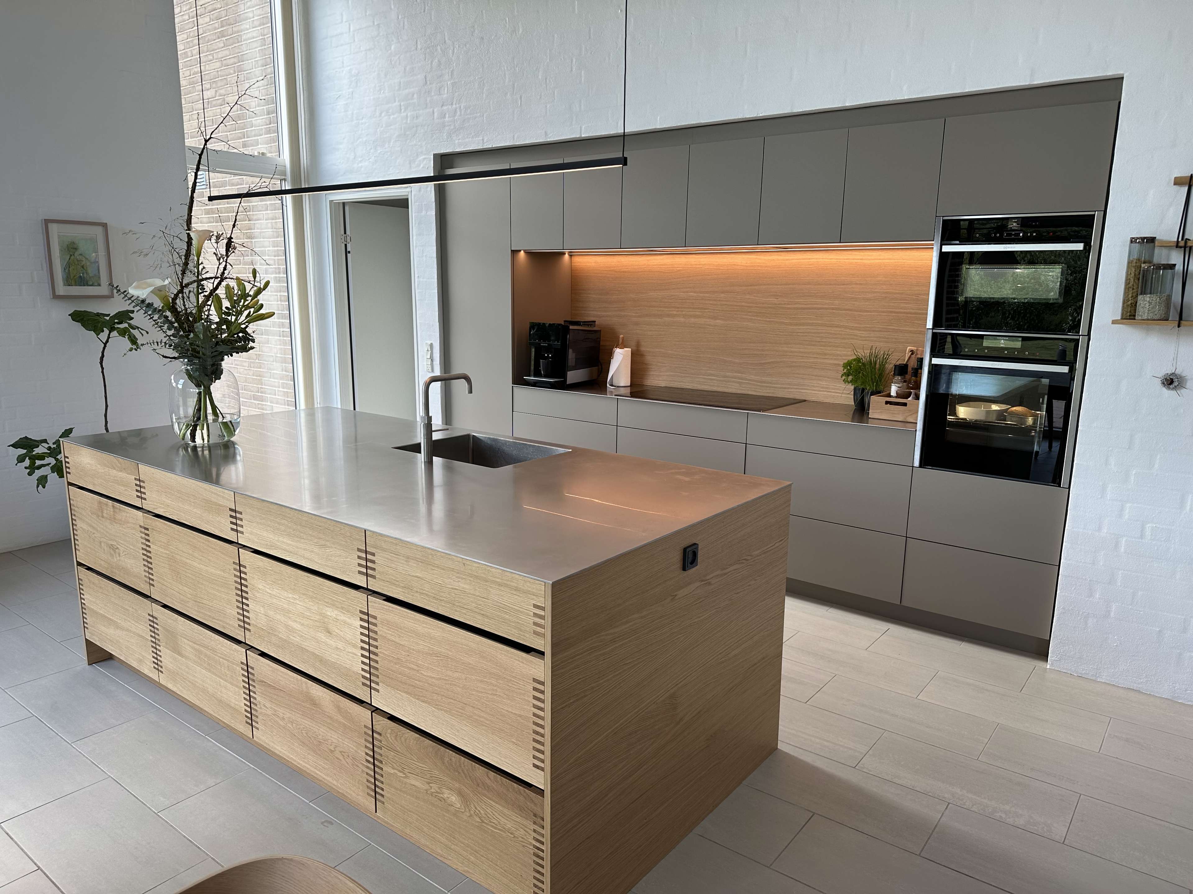
I'll just jump in for a quick explanation. Oakwood is our newest kitchen design. It's our take on the traditional carpenter kitchen with finger joints and solid oak. Bordo is one of our classic designs and comes in clay like Claus chose, as well as black, arizona beige and now also a lovely dusty blue. Its simplicity makes it the perfect companion to let your kitchen island stand out in a design like Oakwood. It's also a great way to keep the price of your kitchen within budget.
And now we'll go back to Claus and Lisa.
Lisa: This is a really nice big island you have here and that is the essence of a Sociable Kitchen®, right? Having a sink where you can do conversations with your guests or your family while doing the dinner.
Claus: Absolutely. You have the sink where you spend the most time facing your family, you have the chopping zone where you use a lot of time facing your family. Andd for us, I mean, this is really the heart of the home. It's the train station of the home.
We, most days we never, we never make it to the living room. We just come home from work and school and we stay in the kitchen until we go to bed. So, designing the kitchen and laying it out so that we are often more people in the kitchen that those people can socialise with whoever is sitting at the dining table or laying on the sofa, that is essential to us.
You can also see we have no TV in here. There would be an absolute no go to put a TV in here. No screens here. Here we are to socialise.
Photo credit: Claus Johnsen

And we are here to take you on a journey through Danish design. We'll be delving even more into Danish design and our concept of the Sociable Kitchen® in this whole series. Episode 2 on the Danish design DNA is available so you can have a listen already now. And please hit subscribe so you don't miss out on the rest of our series on Danish design.
Thank you for listening.
If you'd like to see pictures of all the iconic Danish designs we've mentioned, as well as Claus's new kitchen, please visit our website. You can find the link to that in our show notes.
The Sociable Kitchen® was produced this week by me, Julie Broberg, and sound engineer Magnus Vad.
Special thanks to everyone who appeared in this episode, former chair of the Danish Design Council Lars Thøgersen, Lise Thomsen from the Confederation of Danish Industry, Kvik's CMO Lisa Gøttler and Kvik's Head of Design Claus Johnsen.
Recordings at Claus's home were made by Richard Lightbody and Christian Lightbody. Additional recordings were done at Mastertone Studio in Copenhagen.
The logo was created by our very own graphic designer and brand guardian Helle Krogh.
Our theme music was created for Kvik by Lucas Lunderskov.
We are produced at Feedback Studio in the old meatpacking district near the harbour in Aarhus.
Featured in this episode

Lars Thøgersen
Industrial Designer and former Chair of the Danish Design Council

Lise Thomsen
Confederation of Danish Industry

Claus Johnsen
Head of Design at Kvik
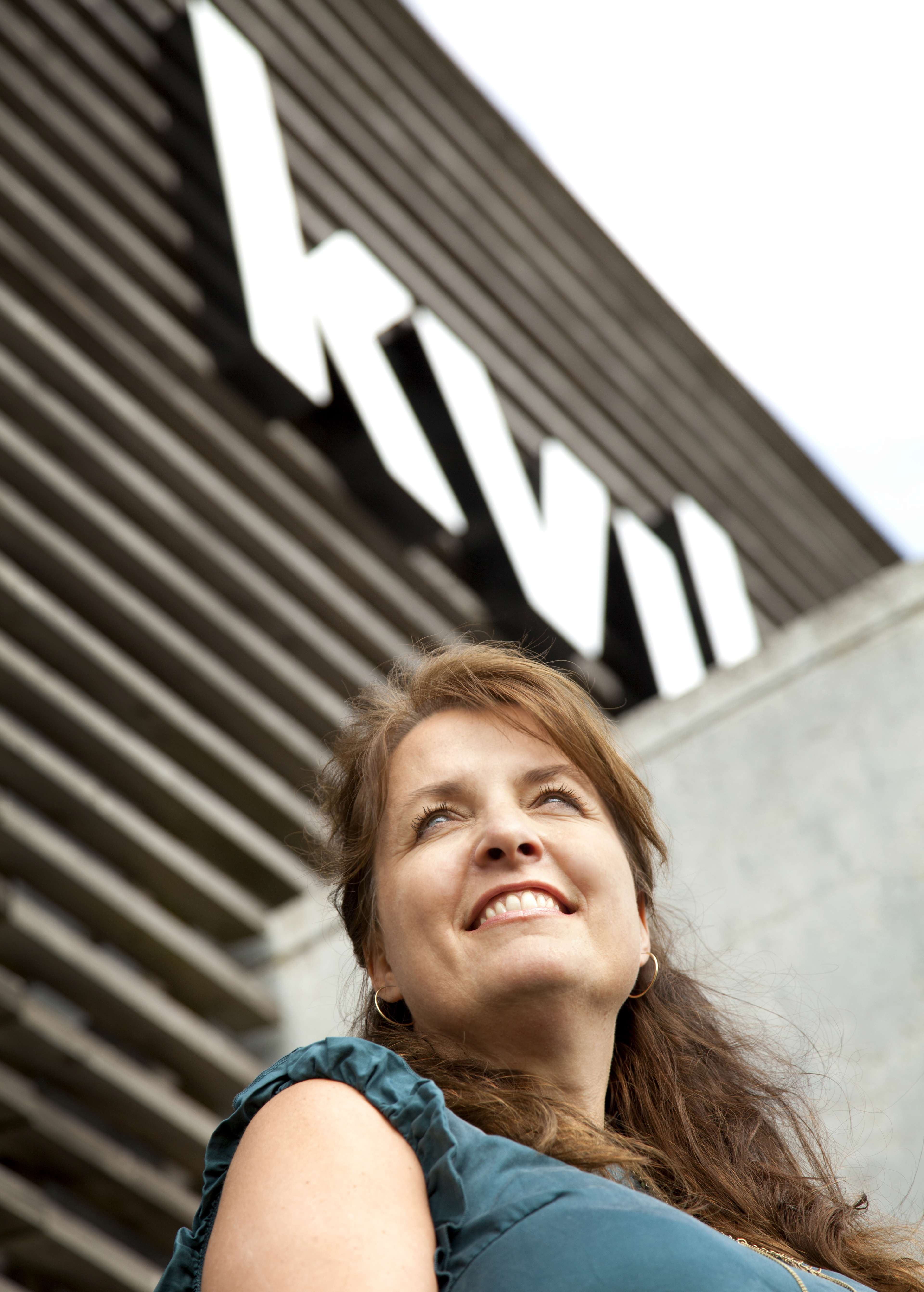
Lisa Gøttler
Chief Marketing & Product Officer at Kvik