
We're back with our second episode on co-creation. We only just got started in the last episode and there's so much more to explore with this exciting facet of what Danish design can do. We had the chance to sit down with furniture designer Lærke Ryom, who we recently collaborated with at Habitare Pro in Helsinki.
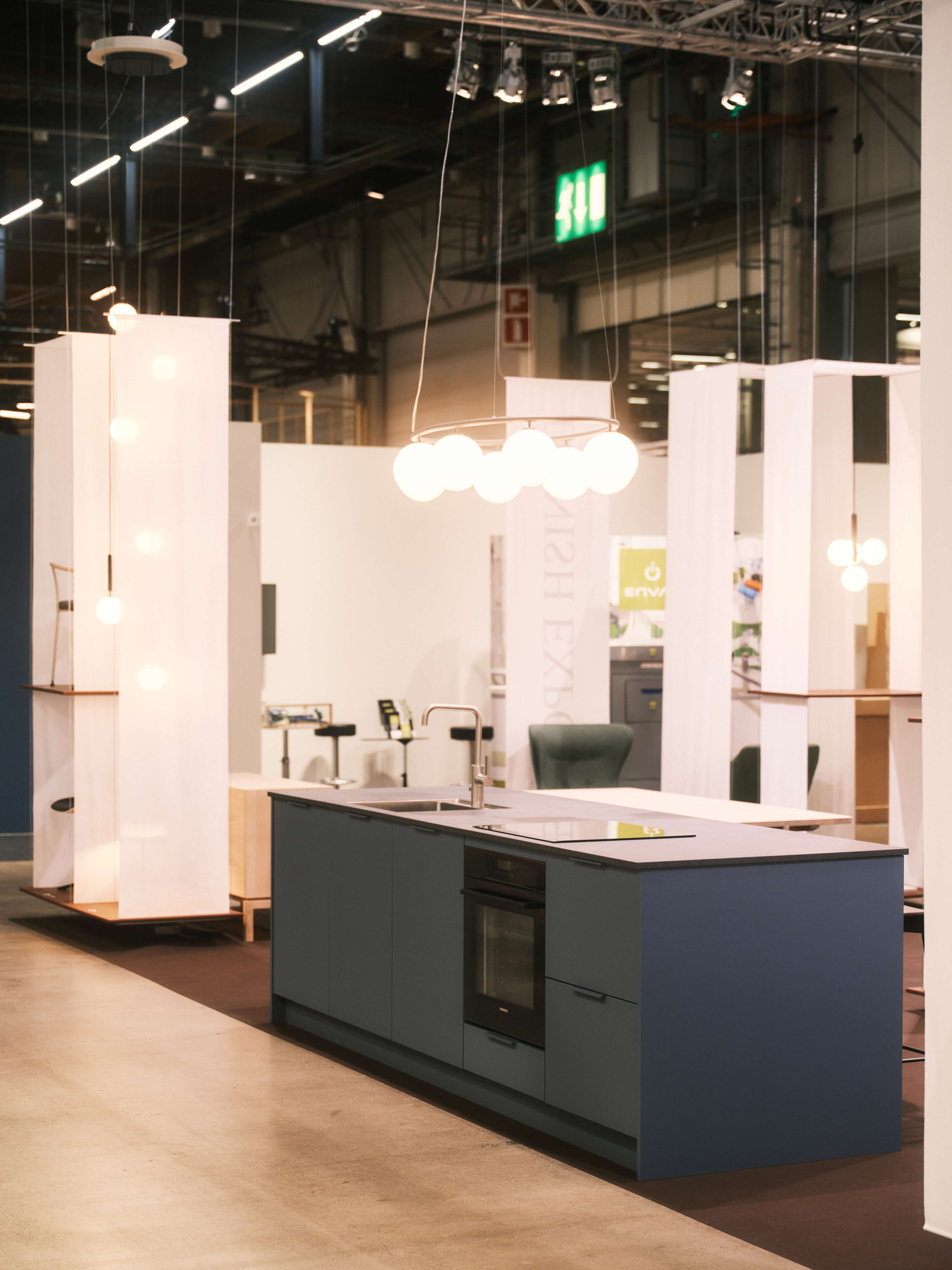
The Confederation of Danish Industry asked this award-winning young designer to create the Danish design stand for the show, featuring us and 7 other Danish brands. The expo stand came together very quickly and space was limited, so Lærke really had to work quickly to make it happen. Our contribution was a kitchen island in our new colour - Bordo blue. We talked to Lærke about how the whole project came together.
*Please note that the text on this page is a transcript of the podcast episode.
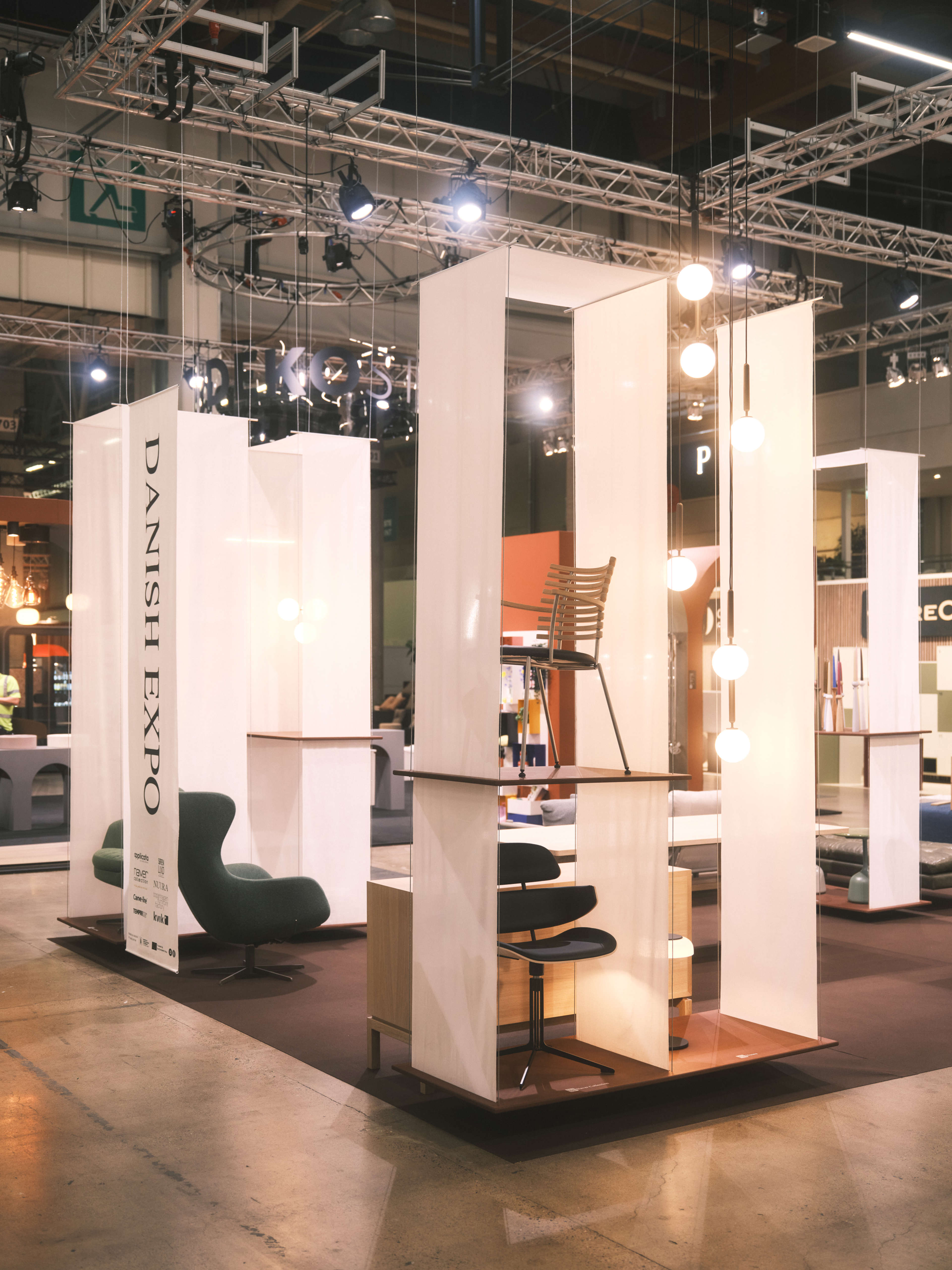
Danish design stand at Habitare Pro
Lærke: It was really a project where I had to find the similarities to kind of tell the story about Danish design and craftsmanship and the attention to material and and everything that is part of the Danish design heritage, but at the same time also being able to leave room at the exhibition for all of the independent stories from each and every one of the brands.
Julie: And all of this was in like, 50 square meters?
Lærke: So it was so tight. So I had this idea of and inspiration from, the Danish stærkasse, which is this...
Julie: Kind of a box or a...hh, I know....you mean like a type case drawer?
Lærke: It's this small wall-mounted display furniture that a lot of children have in their rooms, where you can display like a small stone that you found on the beach or like your favourite piece of toy. So this idea of having a gathering concept that could display all of your most treasurable things in individual rooms. So that was the concept.
Julie: What Lærke made was some light and beautiful suspended shelves for displaying the items. She got the effect of a box by using lightweight fabric on the sides. The result was a light, beautiful space that allowed to her to showcase each individual item in the small space of the stand.
Julie: But how did it work with our...because I think we had a whole kitchen island, didn't we? So was it its own box, so to speak?
Lærke: Some of the bigger pieces were then placed in between all of these rooms or these "podiums" that were hanging. So some of them were placed in the open space also just to optimise the space because it was quite limited with all of the all of the brands.
Julie: And I do think our island had a box in it, right? It had some open shelves, so it fit the theme a little bit.
Lærke: Yeah, exactly. And some some stools, right? Counter stools.
Photo credit: Unto Rautio
Julie: Cool. But that was a big challenge to bring together really quickly.
Lærke: Yeah, but also really fun. And also just really trying to make a design where the designs displayed really came into its own. So really a balance between designing the podiums and everything but leaving space to experience the design on top. So keeping it really minimal.
Julie: Yeah, cool. And it was a lot of different kinds of things, right? I mean, we had the kitchen, obviously. And then what were some of the others?
Lærke: It was a diverse range of products. It was, yeah, your kitchen and more classic furniture companies - daybeds, sofas, chairs, but also home accessories, vases and stuff like this, and also a company making duvets and luxury pillows.
Julie: So you had the soft side as well.
Lærke: Exactly, exactly. But also, just like in the 50 square meters, I couldn't make like a living situation with like a kitchen and a living room and a bedroom. So I had to display it, like, really in a different way.
Julie: The result was a really lovely stand that showcased all eight brands and what Danish design can do definitely an exercise in co-creating a great Danish design experience.
Photo credit: Unto Rautio
Ukurant — a platform for young designers
Lærke won Talent of the Year at the Danish Design Awards in 2022, just as she was graduating from the Royal Danish Academy, in part because of her involvement in co-founding a platform for young designers called Ukurant.
The Group won recognition with their very first exhibition at Copenhagen's Three Days of Design in 2020 and not only do they do exhibitions, but they are platform for young designers to help them make the transition from studying to the real world of being a designer, we asked Lærke about the project.
Lærke: I really wanted to create a platform where young designers also could be seen as a group. So that it's a little more easy to make some noise when you when you're together.
Julie: And by platform...what do you mean by platform? Like you can apply to be part of it? Or how is it a platform?
Lærke: Each year we host this big exhibition during Three Days of Design and we launched an open call where designers actually from all over the world are welcome to apply. And yeah, we have had people from Canada and all over actually being part.
Julie: So you choose sort of a theme and then people should have something within that theme or not necessarily?
Lærke: Not necessarily. Actually, we're quite anti-theme. But that's because we feel like it's a theme enough that you're young, emerging designers and what we really want to bring to the exhibitions is what interests the young designers today. What are they working on? Why are they working on it? How are they working on it? So really, what is their interest and what is their perspective on design right now?
So that is why we are not working with the themes because then people would try and maybe fit in or like angling the projects towards what they thought we wanted. And what we actually want is to see the best that they can do and what they think is what is the most exciting for us to see.
Photo credit: Jonas Jacob Svensson

Julie: Oh wow, do some… I know you don't want there to be a theme, but do some themes emerge are a lot of people working with recycled materials or off cuts or things like that? I mean there must be some commonalities that that emerge.
Lærke: There are always appearing some small like...for example this year, then we had the final selections of pieces...it was…I think we had 18 pieces from designers from all over the world and then we looked at each other and I was like, OK, this year there is a colour that that appears in not all of the pieces, but in many of the works. So yeah, there are some things. It was like this greenish, bluish colour.
And then it's also really interesting for us to see that. We always invite an exhibition designer to create the spacious outlet of the exhibition. And what we see when we begin to put the pieces together is that then there will be a chair made from AI which is really organic and has this crazy shape and then there will be a chair right beside it that is more classic. But then those two will also give each other something.
Julie: Will they have a dialogue sort of?
Lærke: Exactly. Exactly.
Julie: So they they are themselves something and they kind of co-create something between them, right? Well, that kind of gives me goosebumps.
Lærke: Exactly.
Photo credit: Peter Vinther

Ukurant exhibitions

Ukurant 2021
Ukurant 2023

Ukurant 2023
Lærke: It's something that’s magical every time that it happens because….it really just is magical because there are stories being told in the exhibition that didn't exist before they were put together as a group. And that's also why it's so interesting. So there will be so many different stories to be found in the exhibition, both from like, only the visual piece, but also in relation to each other. So. And that's something that groups can that there will arise different stories.
Julie: Nobody planned it, and nobody planned for them, they just arise.
So what kind of spaces do you do? What you choose for this? Is it like a big old warehouse space somewhere down by the water or where?
Lærke: We would really like that, if anyone is listening?
Julie: Yeah. Let's find a great space!
Lærke: No, but actually we have been really lucky with the spaces. It's always so difficult because there are so many that are exhibiting just these three days.
Great locations
Lærke: So, but we have been in the old library in the inner city.
Julie: Oh the one the one that was the old Copenhagen University library. Ohh, I used to go there when I very first came to Denmark when it was a library. It was so cool. Amazing space.
Lærke: Yeah, exactly. I've never been there when it was a library still.
Julie: I think you could probably still feel the all the years of people sitting there reading and learning.
Lærke: Of course, of course. And the history of it. It was old, and really nice. And and they lent it to us for a month. So we could set it up and we had the exhibition there for I think ten days.
But just going there every day and building Ukurant as a group. So going there, meeting your friends, being in this beautiful space with the courtyard, eating lunch in the sun. It was just like a summer that I won't forget because it was a beautiful experience. Also, just like people coming together and creating something.
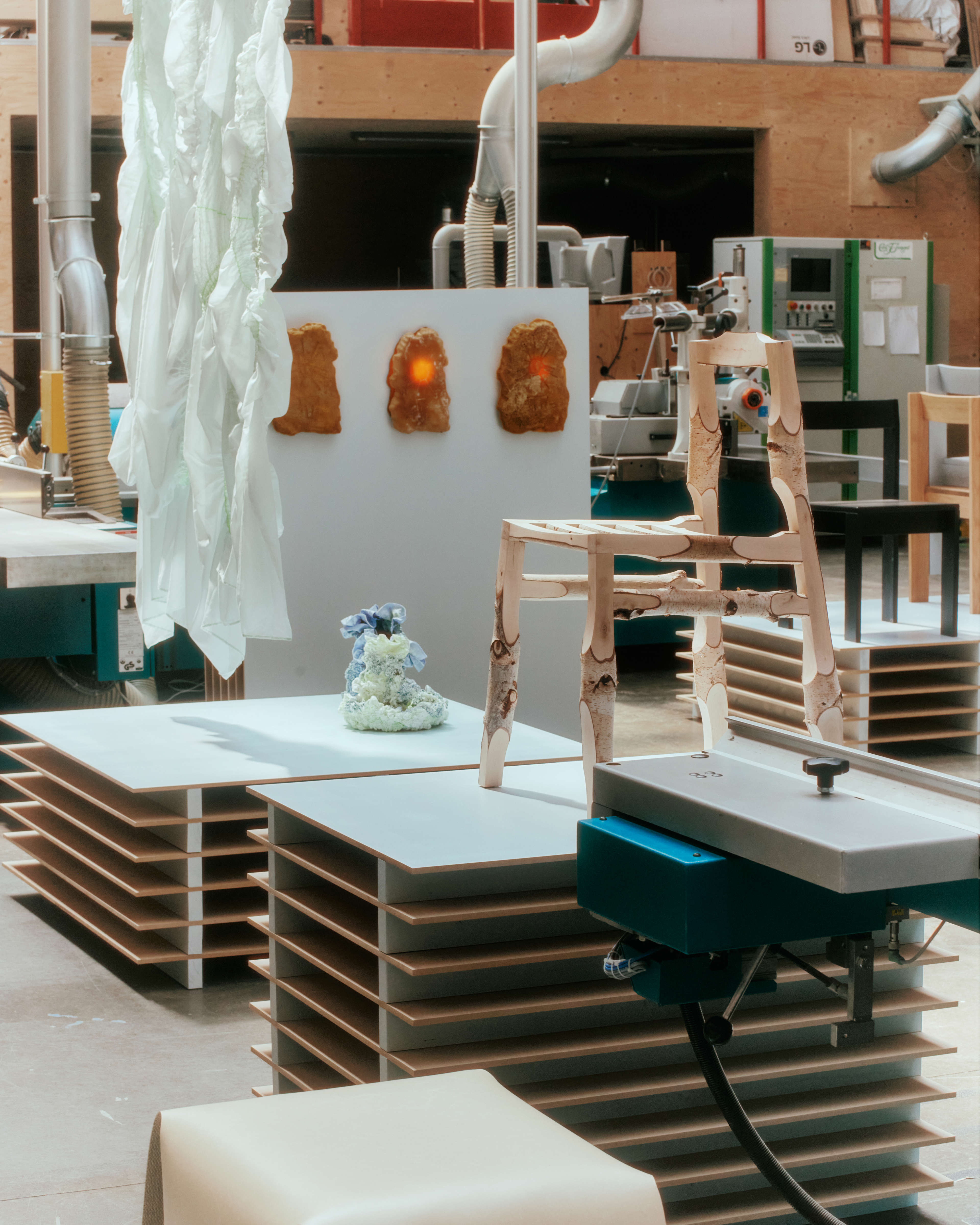
Lærke: This year we had it in a wood workshop out at Refshaløen. And it was so fun to see. It wasn't planned or intended that we were going to have it there, but then we found this beautiful space with high ceilings, just as grand feeling as the old library, but a completely different vibe. Like raw machinery, stacks of materials against the walls, and just a really, really, really, really beautiful space. And then just seeing how the space then transformed when we placed all of the pieces.
And during the exhibition there something, another story was told in the exhibition because you got this the feeling of all the hours that the young designers put into all of the pieces, the craft, the work that went into them.
Julie: Because it was in this workshop, it felt like they were made there.
Lærke: Yeah. And of course it wasn't made there, but it was just like the feeling.
Julie: Really? So actually the space was part of the co-creation.
Lærke: 100%! And that's the most fun thing that when you can move into a place that also gives something back that is just not just a white cube but that it also brings a story.
Photo credit: Jonas Jacob Svensson

Julie: So Ukurant is on one hand, a yearly global exhibition during Three Days of Design in Copenhagen, but Lærke also characterises it as a platform. We asked her to explain a bit more about that...
Lærke: It's also because we are working a lot with creating this community between the young creators so it's also about having a platform or a space where you can bounce ideas off of each other. And also if I have a question or something, I can use the other designers’ knowledge and their experiences to create my own.
Something that we're talking a lot about these days is economy. So like if I have someone ask me do you want to do this? And then I say, OK, we are almost always interested in doing projects, but then talking about...so what is the financial side of a project?
Julie: What do I charge for it? What do I what to do?
Lærke: OK, so I made this custom made piece and now I have a customer who wants to buy it. But how do I price my work? That is also something that we are then using the community to really have each others back and to really be better together.
It’s nice to see that the industry is really looking our way…the more attention we get from them, the more possibilities we can create for the young designers. We're also working for the designers getting things into production, or so really trying to push them out in the industry and creating a professional life for them.
Julie: Co-creating a design career doesn’t sound like a bad idea. I look forward to seeing what the young designers of Ukurant do at next year’s Three Days of Design.
Co-creating Ombra with SaysWho
We’re no strangers to co-creation ourselves in Kvik. We collaborated with the Danish design firm SaysWho on our popular green Ombra kitchen. The project, of course, started with a solid design brief that was true to our concept - which is to have a carefully curated collection of beautiful kitchens for customers to choose from, rather than a wide range of styles and colours.
Our business relies on volume, so it’s important to us that our designs have broad mass appeal. As Nikolaj Duve from SaysWho puts it, we are aiming at the 8 of out 10, rather than at the more exclusive 2 out of 10. So our designs have to have something special that catches the eye of many people, as well as end up at a price point that most can afford.
Initially, SaysWho, who hadn’t designed any kitchens before this project, did a lot of research into the kitchen market, getting a feel for what was out there and what people were looking for. As the collaboration with us went on, it became more and more apparent that sustainability was something that people were increasingly looking for. Ombra became the first kitchen that we released featuring recycled PET plastic foil. Once that was decided, we got into the details of co-creating the design with Nikolaj and his team at SaysWho.
Nikolaj: The whole whole sustainability thing about reusing plastic for the foil fronts was really interesting as well, so as we and as Kvik sort of dived deeper into it and I think that's how it should be.
We're trying to investigate what is there to figure out, what is the relevant thing to do and and how can we apply design and aesthetics to that? But we need to figure out what to solve first.
Ombra

Sustainable materials
Explore Ombra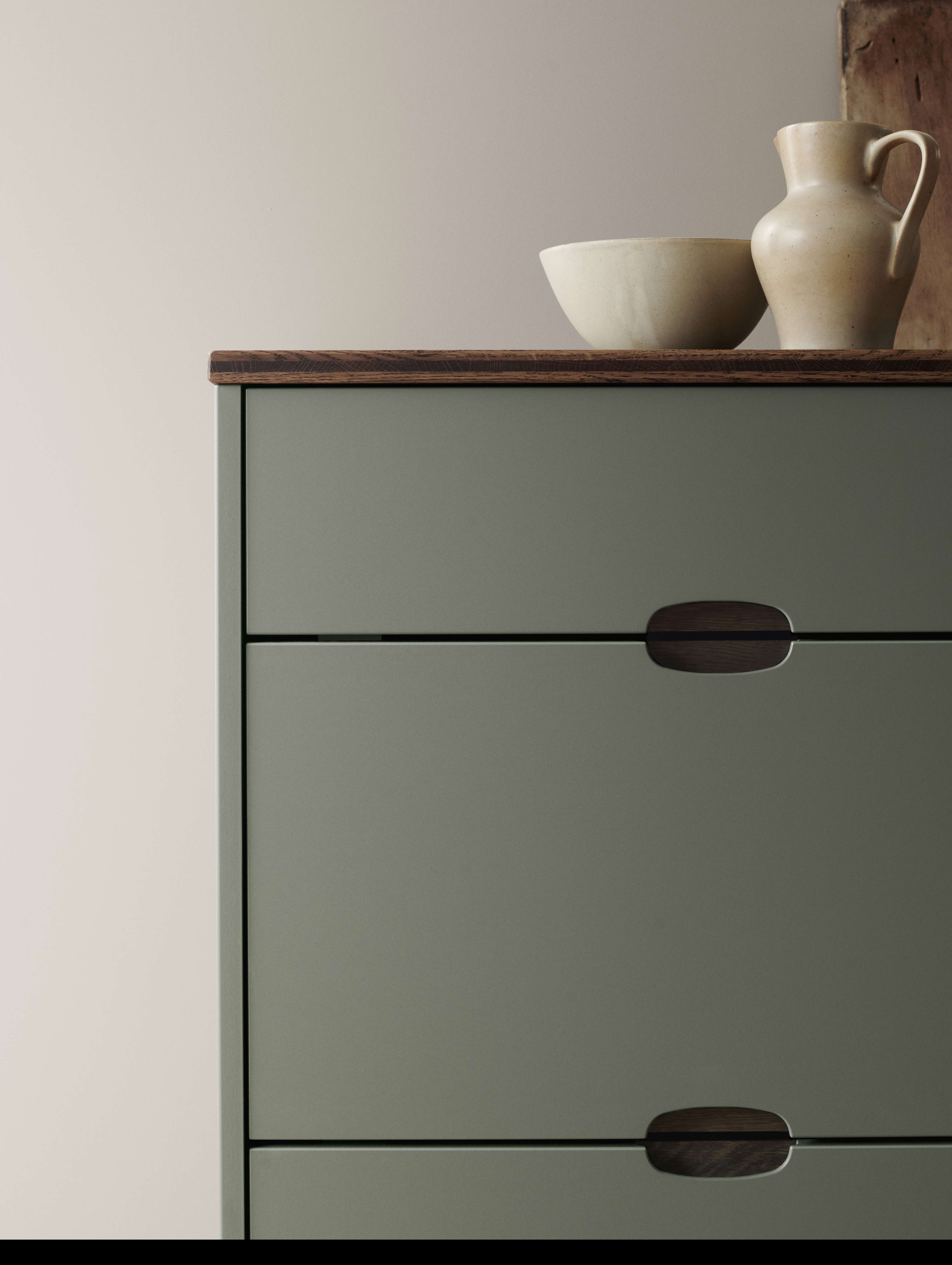
Smooth pebble-shaped handles
Explore Ombra
Pleasing oval shape
Explore OmbraRethinking what works
Nikolaj: So we ended in that sort of sustainability approach because there was a lot of value there. And then for us, things started to make sense that we're gravitating towards sustainability. There's a lot of facts. And if you ask Kvik, they will tell you how many good things there are about a kitchen like that, just the amount of tonnage they're recycling. It's hard not to fall in love with that, and we did as well. So the mission was to sort of how do we embody that in the look so we turned to nature.
We believe that the consumers, as I think you stated earlier, they don't maybe understand CO2 emissions and impacts and what not, but they can look and understand what feels natural, right? So that became the direction and then we looked at a lot of stuff and then also looking sort of into the assortment, what what could be the thing that they are missing? What could be a timeless thing? So we looked at Mano, that whole thing about cut out handles, which they have really got a good grasp on, which seemed to be really timeless and functional and you know, fitting well into the idea of dirty hands in the kitchen and easy manoeuvrability and all.
Julie: Nikolaj is talking about our classic Mano kitchen design. It's been our best selling kitchen for nearly 20 years, and we've been refining it and perfecting it throughout its integrated handles fit perfectly to your fingers, making it easy to open. In fact, that's where its name comes from. Mano means hand in Italian.
So taking this well-designed idea and rethinking it and expanding on it was a great starting point for what became our Ombra design.
Nikolai: And we came up then with another take on that, which then was another handle that was cut out to get that same comfort and practicality but in another look. And then so now the process is at a point where now we're into nuances as well.
Furniture handles have been around forever, right? So figuring out the proportions relative to your hand and how they fit together in a system where the customer can customise the kitchen can look in thousand different ways, right? So the handle needed to be fairly universal somehow. And then together with Kvik we derived that that system where we could do a cut out that meets if two fronts are put on top.
And and that was quite interesting, because then there's two shapes in one, you know that. That's how it looks when it splits and and then it's the whole, exactly. And then we looked towards shapes that would sort of embody that.
Julie: It's the half and it's the whole right?

It could only be green
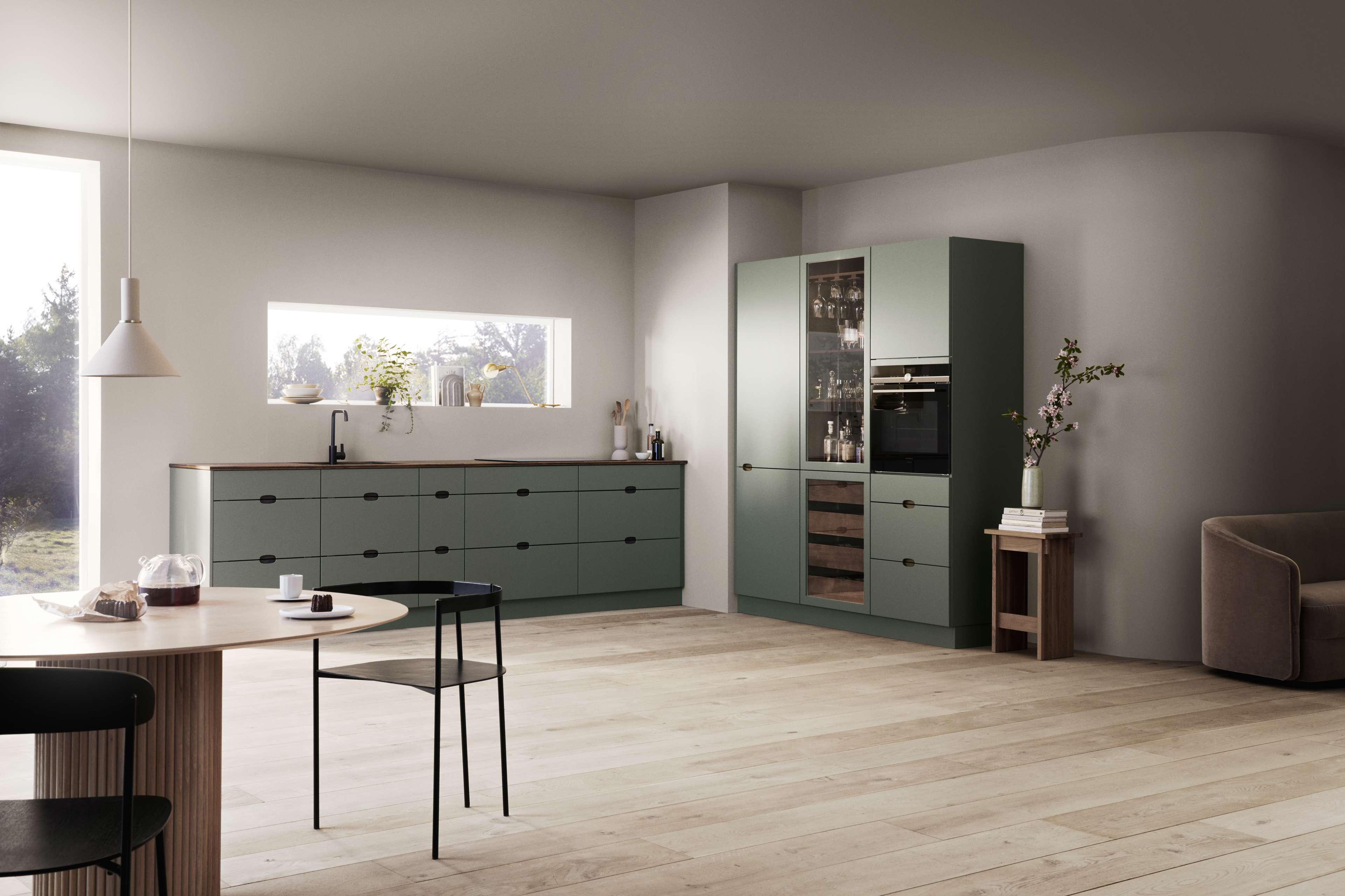
Nikolaj: Yeah. ...a naturalistic feel, so it couldn't be like straight lines that would not be the right thing to match into this. We wanted to have some natural material in there as well because that just fits really well with the idea of a sustainable kitchen. So we ended up in that pebble shape because I think everybody's been to the beach and seeing these, you know, really smooth pebble-shaped rocks, right?
So that became our icon basically. And from that we did, I don't know how many iterations around how the millimetre, the radius should be. And then combining that with the wooden inlay.
Julie: So you can change the colour that appears behind the oval.
What Nikolaj is talking about here is Ombra’s distinctive oval-shaped handle. Its smooth curves echo the large, smooth pebbles found on many Danish beaches and in fact, the internal name for this kitchen was actually Pebble. There’s a small piece that you can switch out to give your kitchen a unique look - choosing a dark oak contrast for example, or bronze for a bit of luxury or maybe green for a tone-on-tone look. You can see pictures of it on the page for this episode on our website. There’s a link in the show notes.
Nikolaj: Exactly! So you get that and then sort of things fell in place because now we had a look that they didn't have, we had a sustainable or more sustainable kitchen than was previously accessible and we had a good story that matched that the consumer, we believed, would really directly understand. So for the 8 out of 10, we did all we could to embody, visually, materiality-wise, something that would be the most sustainable we could do. Combining that, of course with Kvik because they know really a lot about this stuff. So that was a happy marriage.
Julie: And so you were working together with the design team within Kvik the whole way through?
Nikolaj: They would sort of start everything out. We would do our thing and go nuts and then we would meet and then they would get surprised and we would get smarter and then we would talk a lot and they would inform us and then we would move again and slowly it’s just moving towards each other. And then ending with something that nobody could sort of argue against.
Can we achieve a certain price level that would make it relevant? I think as we do as well as Kvik does, is that we only make a sustainable impact if we achieve the eight out of ten and the volume because that is where you really push the sustainable agenda.
So it was just a happy marriage at the end of the day and then finally it ended up with us, I remember we were standing in Kvik, and having to decide should we, should we launch this in white just to be safe or should we launch it in green, a completely green kitchen in 180 shops? That was quite terrifying, actually, but we all believed in the mission and and that the whole, you know, the whole idea behind that kitchen.
It could only be green.
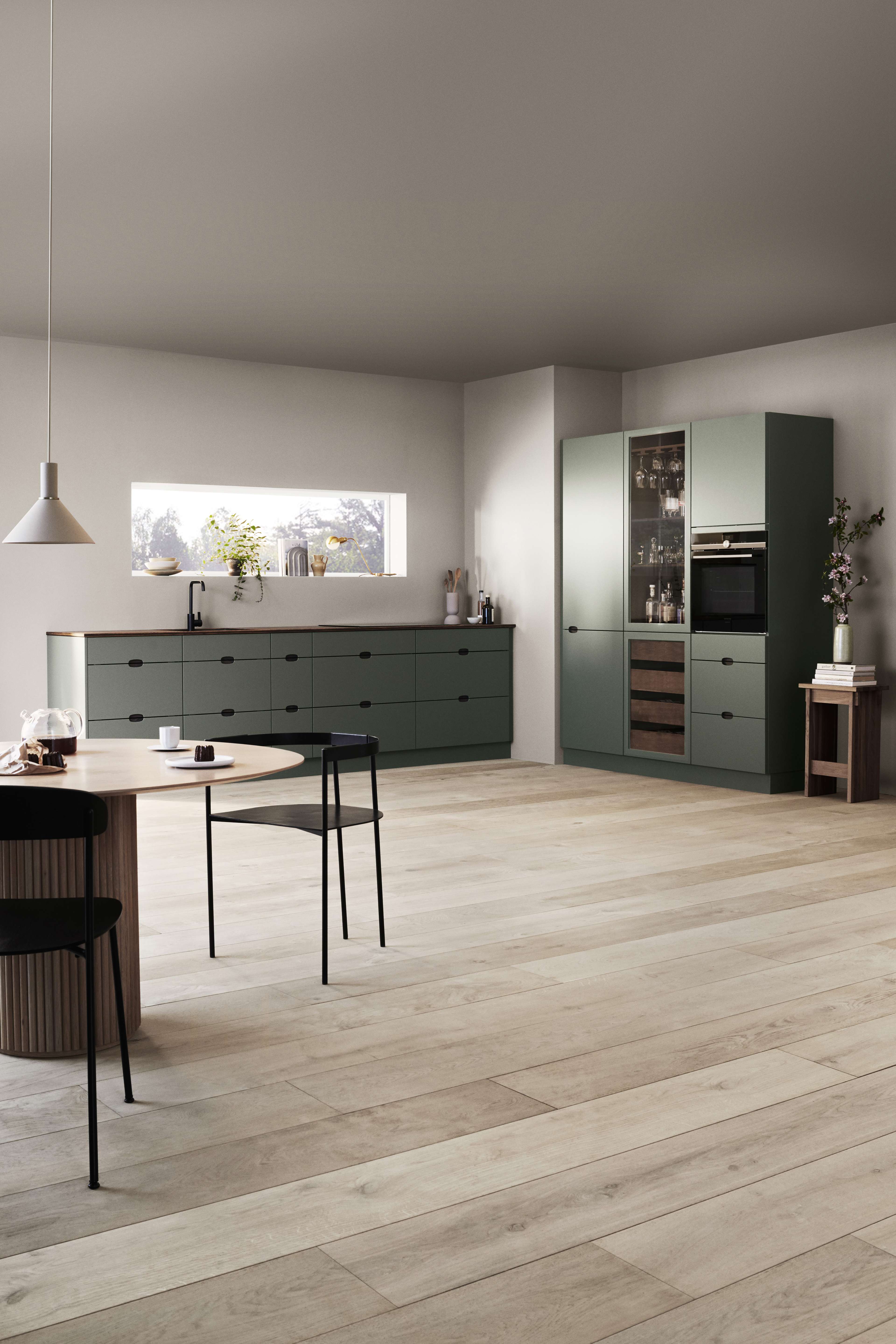
And it seems that our customers have also believed in our green Ombra kitchen, as it’s been one of our top sellers since its introduction in September 2020. We’re also firm believers in co-creation for our Danish designs. We’ve since worked with Nikolaj and SaysWho on our Corisa kitchen and also on the bar stools that we recently released. You can see those designs on our website and you’ll find a link in the show notes.
Next time on The Sociable Kitchen®, we will take a look at where Danish design is headed and that will be the final episode of this, our first series on Danish design. If you haven’t already, hit subscribe now so you don’t miss out.
We like to leave you with a podcast recommendation. This time, we’ve been listening to a couple of episodes of the podcast Wardrobe Crisis that featured Danish designers. Fashion has been beyond the scope of our investigation of Danish design, but that doesn’t mean it’s not interesting. We especially recommend the episode featuring fashion designer Henrik Vibskov and the one featuring clothing designer Cecilie Bahnsen, they’re not too far back in the Wardrobe Crisis feed, wherever you listen to podcasts.
Until next time, thank you for listening.
Featured in this episode
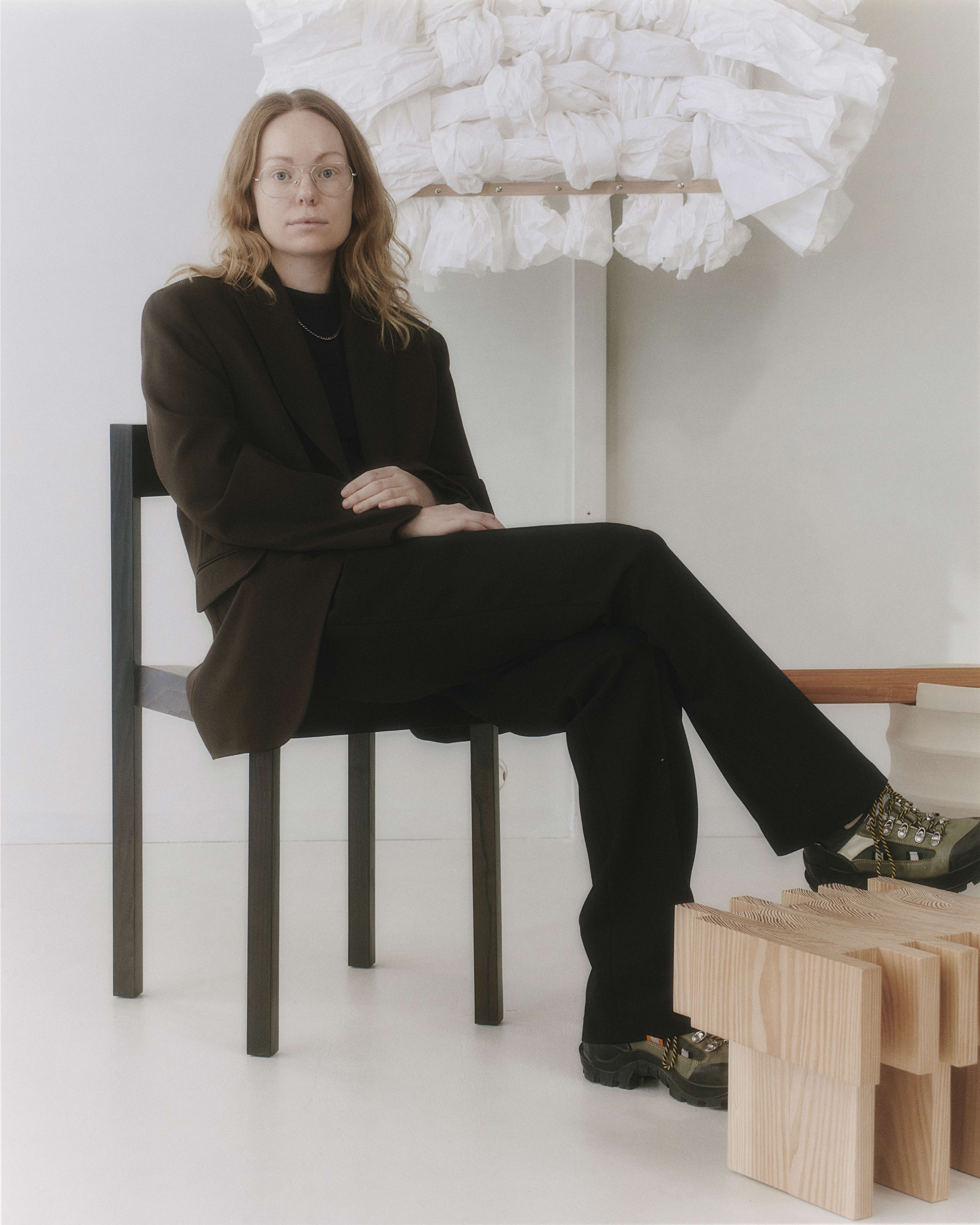
Lærke Ryom
Furniture designer
Nikolaj Duve
Head of Design & Co-Founder, SaysWho

Julie Broberg
Host of The Sociable Kitchen® podcast